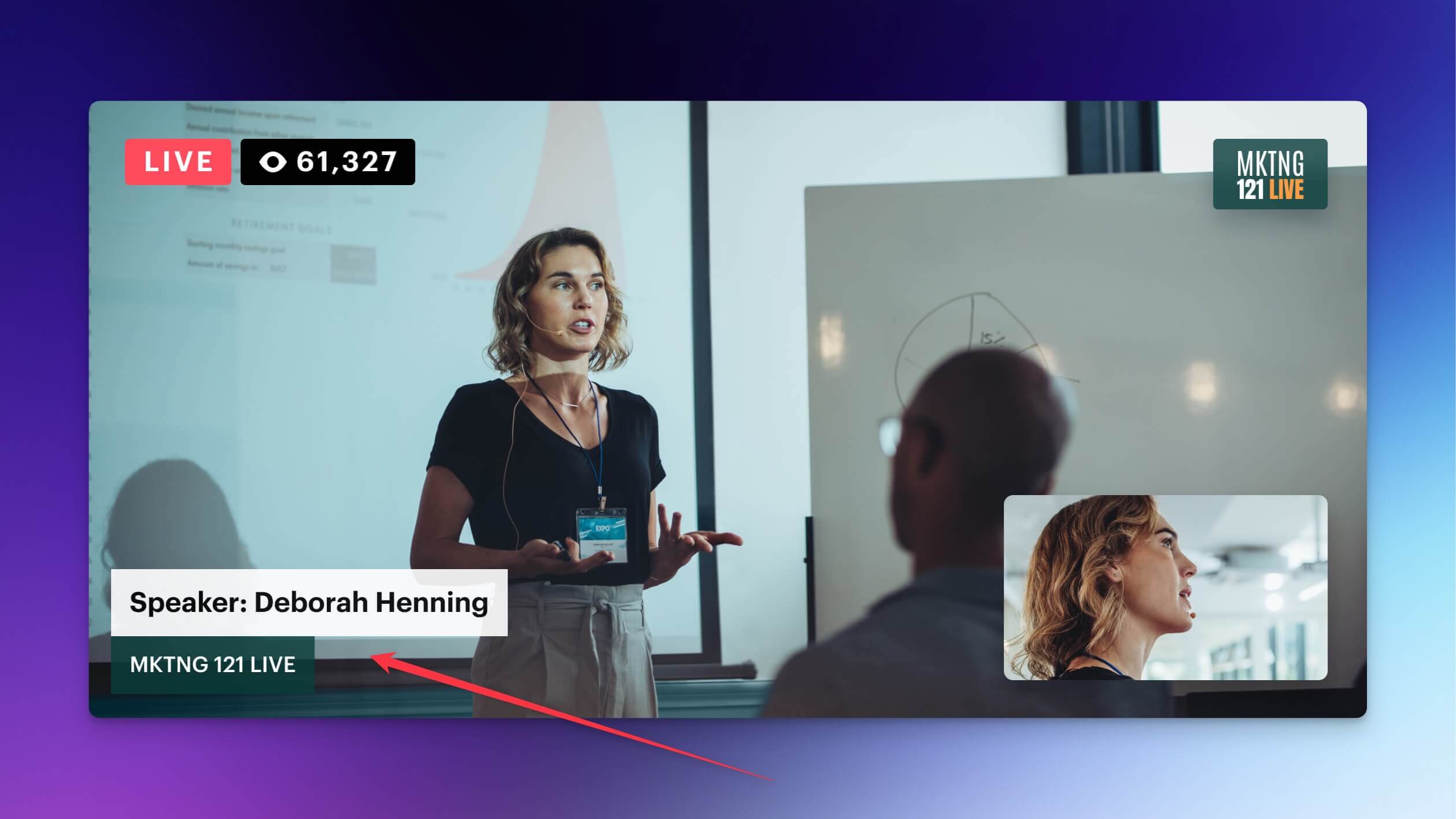
Lower third
What is a lower third?
The lower third is a type of graphic overlay that takes up what’s known as the “title-safe” lower area of the screen. It doesn’t always have to fill the bottom one-third of the screen as the name suggests.
Lower thirds provide information and context for what’s happening on-screen. They might communicate who’s speaking and their title, a location, a time, or other relevant information that isn’t readily apparent from watching the stream or video.
You’ve most likely seen a broadcast or video using lower thirds. News media organizations use lower thirds all the time, placing a graphic with the name of the person speaking or the location they’re in at the bottom of the screen. Documentary films use lower thirds to announce who’s speaking. Sports broadcasts will display the score and other information during a game or match.
Lower thirds are perfect for displaying viewer questions and comments during the stream, or introducing another speaker. You can also use them to add a website or social handle.

Tips for making a good lower third
How do you make a lower third? Audiences are used to seeing lower thirds with certain placements and styles, and they expect any graphics that appear on-screen to be consistent – both with each other and with overall branding. When you start designing your live stream’s lower-third graphic, keep the following tips in mind.
1. Make it readable
Lower thirds almost always contain text. This text should be readable. Choose a good font, place the lower third in the best spot, and provide enough contrast between the video and the graphic. If your footage is mostly dark, choose a lighter-colored lower-third graphic to offset it.
2. Choose the right font
Your font choice should be consistent with the rest of your branding, so if you already use a font for your other graphics, then stick with that. In most cases, a sans-serif font works best for a lower-third graphic.
3. Apply good placement
Although it’s called a “lower” third, you don’t have to put it in the lower third of the screen. The reason this particular placement is so common is because it’s ideal for footage of someone speaking on camera. If you follow the rule of thirds, then you know your subject’s eyeline should be in the upper third. Placing a text-graphic visual in the lower third adds balance. But if your footage isn’t of someone speaking or isn’t a close-up shot, you can play around with where you put your graphic. Just make sure you don’t place it too close to the screen’s edge.
4. Use your brand colors and style
Keep visual elements across streaming and social media platforms consistent. If you don’t have a brand color or style yet, then take the time to choose these features before you start designing a lower-third graphic. Choose branding that’s relevant to your audience and your category of streaming.
5. Complement your content
The lower-third graphic should enhance your content, not be your content. Don’t let your lower third take up too much of the screen, and don’t make it so complex that it draws attention to itself. The lower-third graphic provides context, but it isn’t the star of your show. When deciding on a design, remember: simple is always better.
Use cases for lower thirds in live streaming
You may understand why lower thirds are important to your live stream and what makes a good lower-third graphic in theory. But knowing the theory and putting it into practice are separate things. Below are some common use cases for lower thirds in live streaming.
Introducing a guest
If you’re hosting a guest on your live show for an interview or as a guest host, you can have them introduce themselves at the start so the audience knows who they are. But adding a lower third with their name and title will make it much easier for viewers to remember their name or know how to spell it if they want to research that person later.
CTAs
Lower-third graphics are perfect for an on-screen call to action (CTA). Add your website or blog URL, your social handles, or a link to buy merch. You can say the name of your URL out loud, but adding a lower-third graphic with your URL at the same time you’re saying it reinforces the message for viewers.
Quotes
If you want to feature comments, questions, or quotes from your live chat, you can display them as a lower-third graphic. With Restream Studio, you can show any message from the chat on-screen by going to the Chat tab on your Live Studio dashboard. You’ll see messages coming in from all the channels you’re streaming to in the chat window. To show one of these messages on-screen, hover over it, then click Show. The message will appear as an overlay, along with the username of the person who sent it.
Church services
Lower thirds can display the name of the pastor when he’s speaking, along with the theme of his sermon. When the pastor or speaker references a specific Bible verse, you can display it on-screen so viewers watching at home can look it up.
Source citations
If you’re showing copyrighted clips or footage that doesn’t belong to you, you can add a lower third to credit the owner of the content.
